
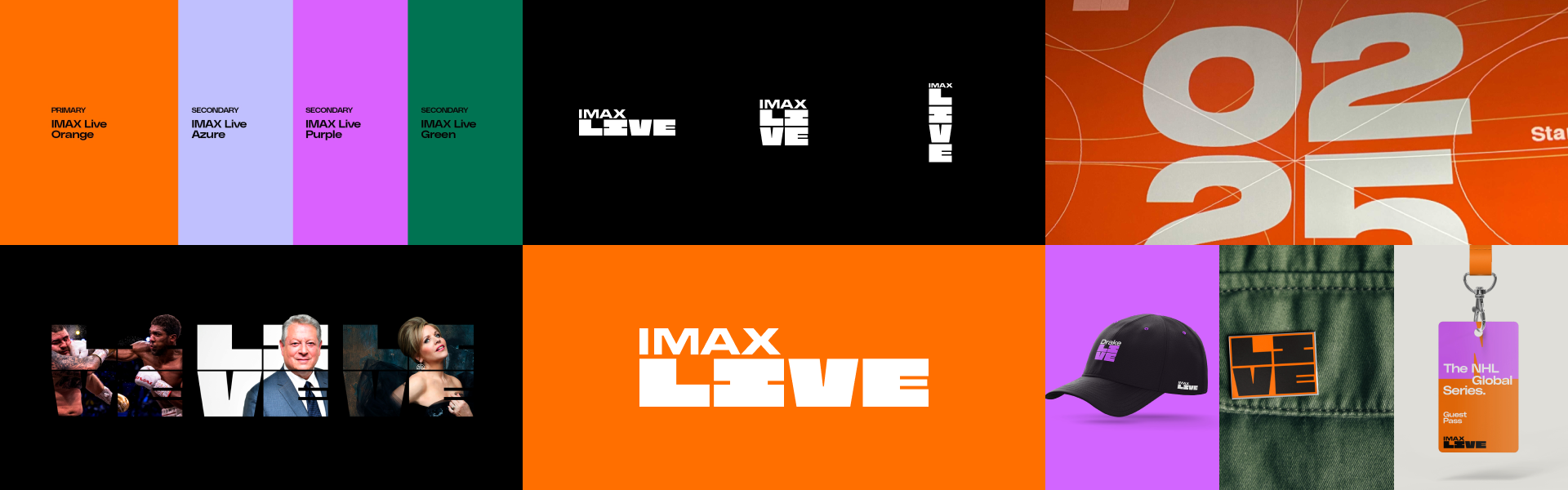


Color update & UI elements
Two shades were added for each color, and a few shades of gray to contrast the black background of UI.
Dark and light shades are necessary for the disabled state of buttons, elements that need to be toned down for visual hierarchy purposes, etc.
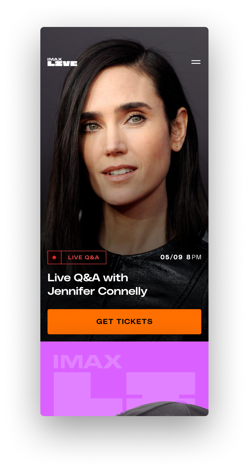
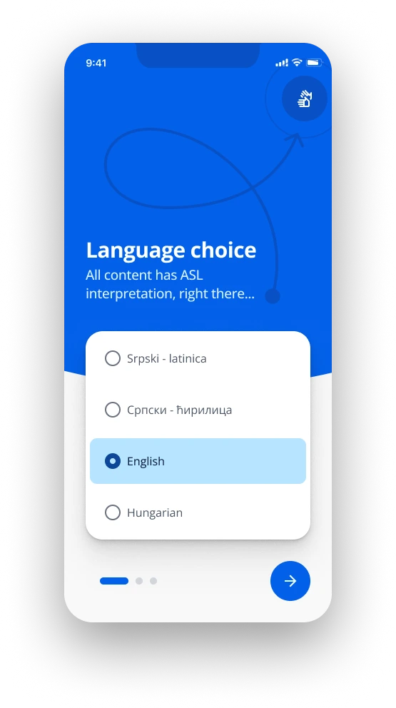
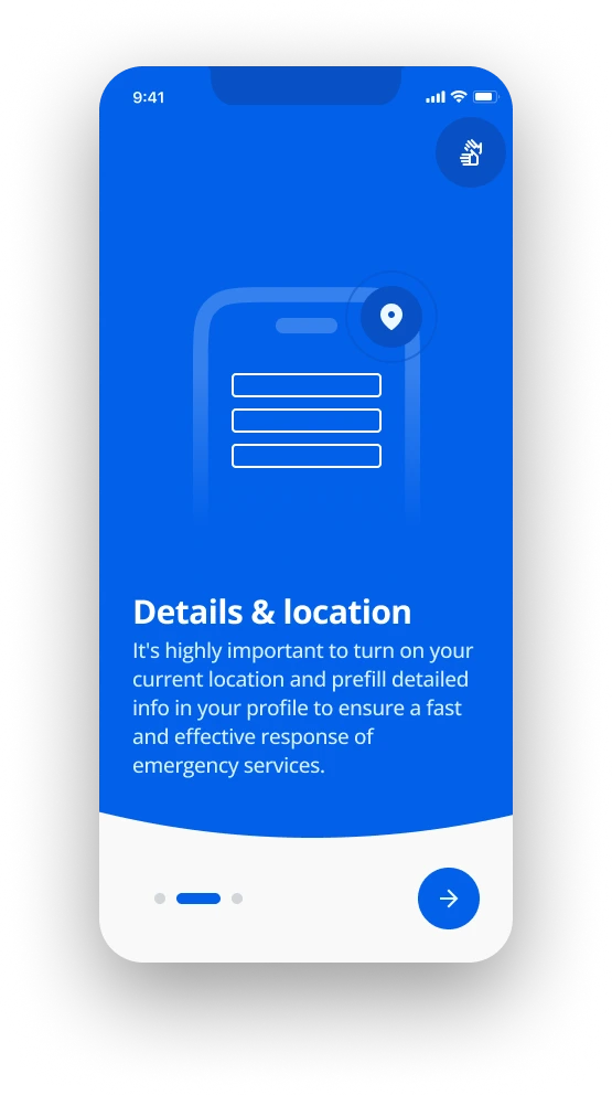
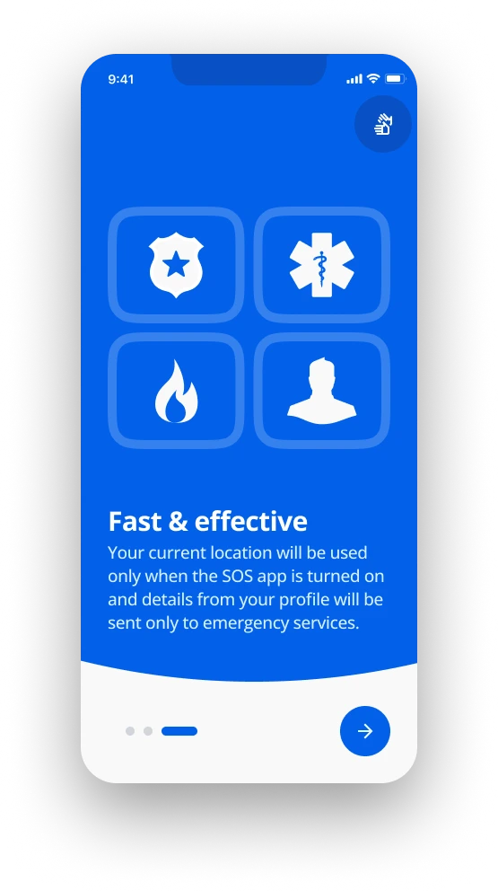
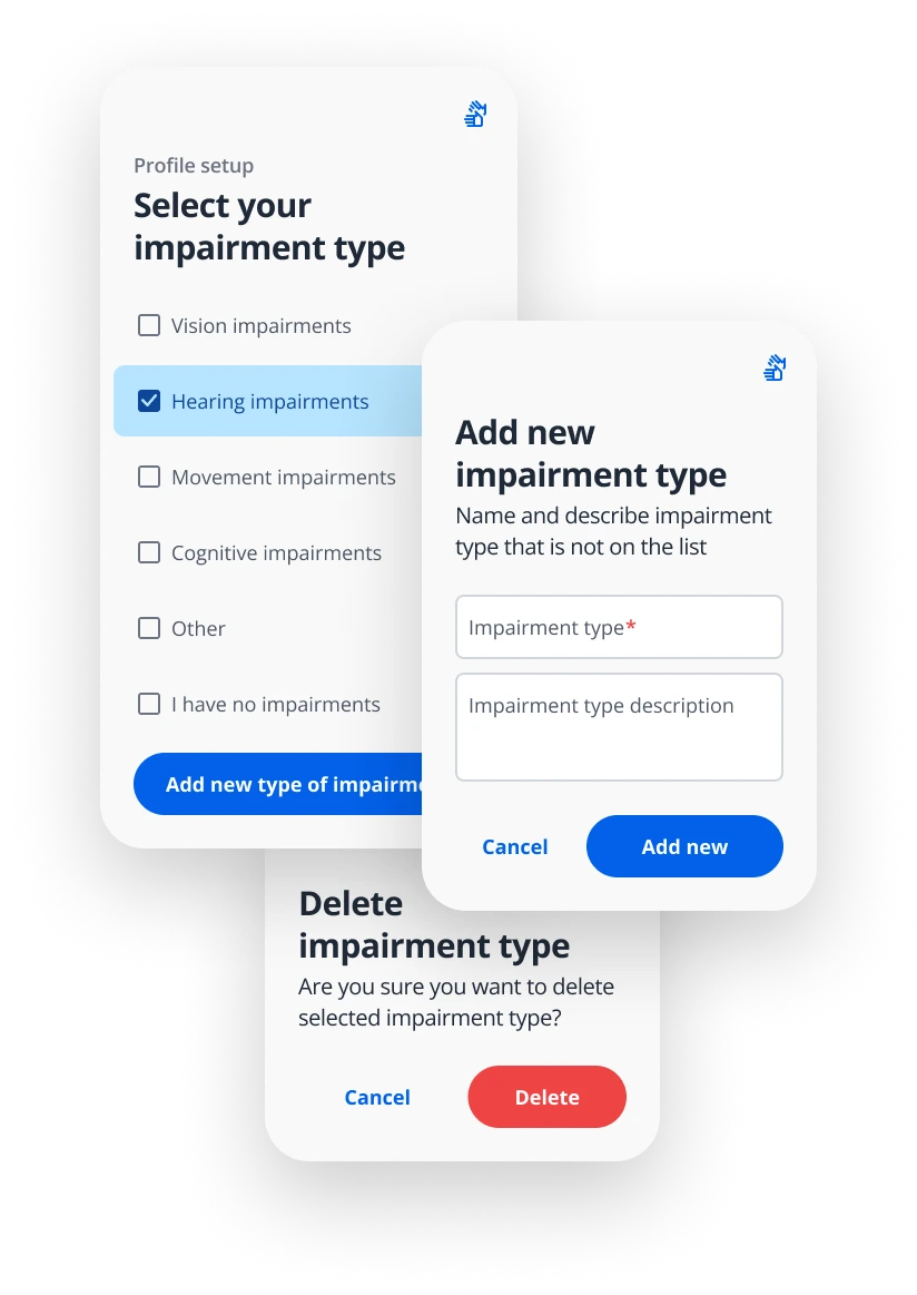
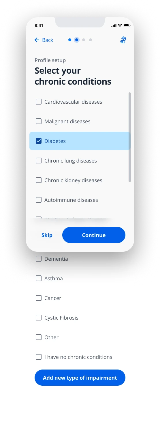
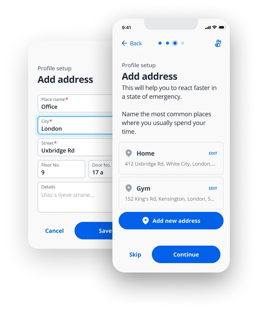
The usual content on this app is highly colorful, and the details are edgy and loud, so buttons tend to sink into the content. That also applies to tags, selections, inputs, and other elements.
That’s why the decision was made to make them rounded slightly and with a lot of white space. That gave those elements the necessary attention.

